Tran3D: from Zero to One
I initiated my career as a lead on a startup product—Tran3D. In this article, I would like to share with you some of my design from strategy to interface.
OVERVIEW

About the project
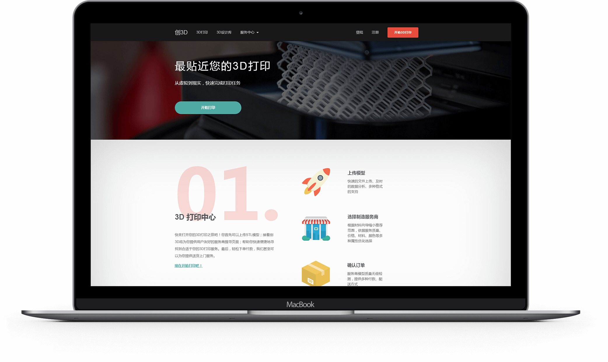
Tran3D is an online 3D printing service platform where distributed 3D printing resources are gathered, shared, and applied.
How it works
Tran3D runs a C2C business model. It facilitates transactions between 3D printer owners and people who want to make 3D prints. Service bureaus can join the platform to offer printing services while customers can select one of the best solutions we recommend to get their customized models printed.
My roles
I led the product, UI/UX design, and front-end development from the start.
As a designer in particular, I worked on
- User research
- Product design
- Information and interaction design
- User interface design
How I started
Working closely with my team, I first made a Q&A sheet that depicted our potential users.
User Brief
Who are the target audiences?
Modern people who enjoy customizing things or transforming ideas into reality using technology.
What are the audience types and their differences?
There are three main types. 1. Common individuals—people who need 3D printed products, but without 3D printers; 2. Designers—people who are capable of producing high-quality 3D models; 3. Manufacturers—people who own 3D printers, can either be individuals or companies.
Where can audiences be found?
Most likely, they can be found in universities or manufacturing industry. They might have active accounts in 3D printing forums.
What personality does Tran3D want to project to the audience?
Simple, rapid, technological, playful and high quality.
Based on the user brief, I interviewed 50 early adopters via telephone and finally planned out our design goals.
- To facilitate an intuitive and seamless experience
- To enable meaningful and engaging interfaces and interactions
- To create convenient and powerful functionalities that can manage services and transactions
Next, I will choose three representatives that best accomplished our design goals. And I will talk about their design processes and deliverables.
START A 3D PRINT
The Problem
3D printing features rapid prototyping and product customization. It enables consumer products to be made on-demand, eliminating the restriction to craftsmanship and manufacture, as well as reducing the waste from overproduction and overpricing.
On the consumer side, however their expertise, most people expressed their interests in transforming their ideas into reality and their curiosity about 3D printed objects during interviews.
So here comes the problem—how might we get customers onboard in order to fully deliver the quality of 3D printing to them?
The Analysis
To introduce complex technology home, Tran3D must provide customers with an easy and fast channel to getting their hands on real 3D printed products. The main idea is to build a module that helps users start a 3D print and guides them quickly through a customization flow before they reach the shopping cart. Some core design principles were identified:
- Prominent entries—CTAs draw attention and trigger interests.
- Easy start—Tasks that are easier to do are better starting points for people with low motivation (refer to BJ Fogg Behavior Model).
- Limited choices—It’s often easier to make a decision when presented with few options.
- Hidden expert-level interfaces and terminologies—Expert users are the minority.
Overall, the customization flow should be lucid, efficient and interesting.
The Exploring
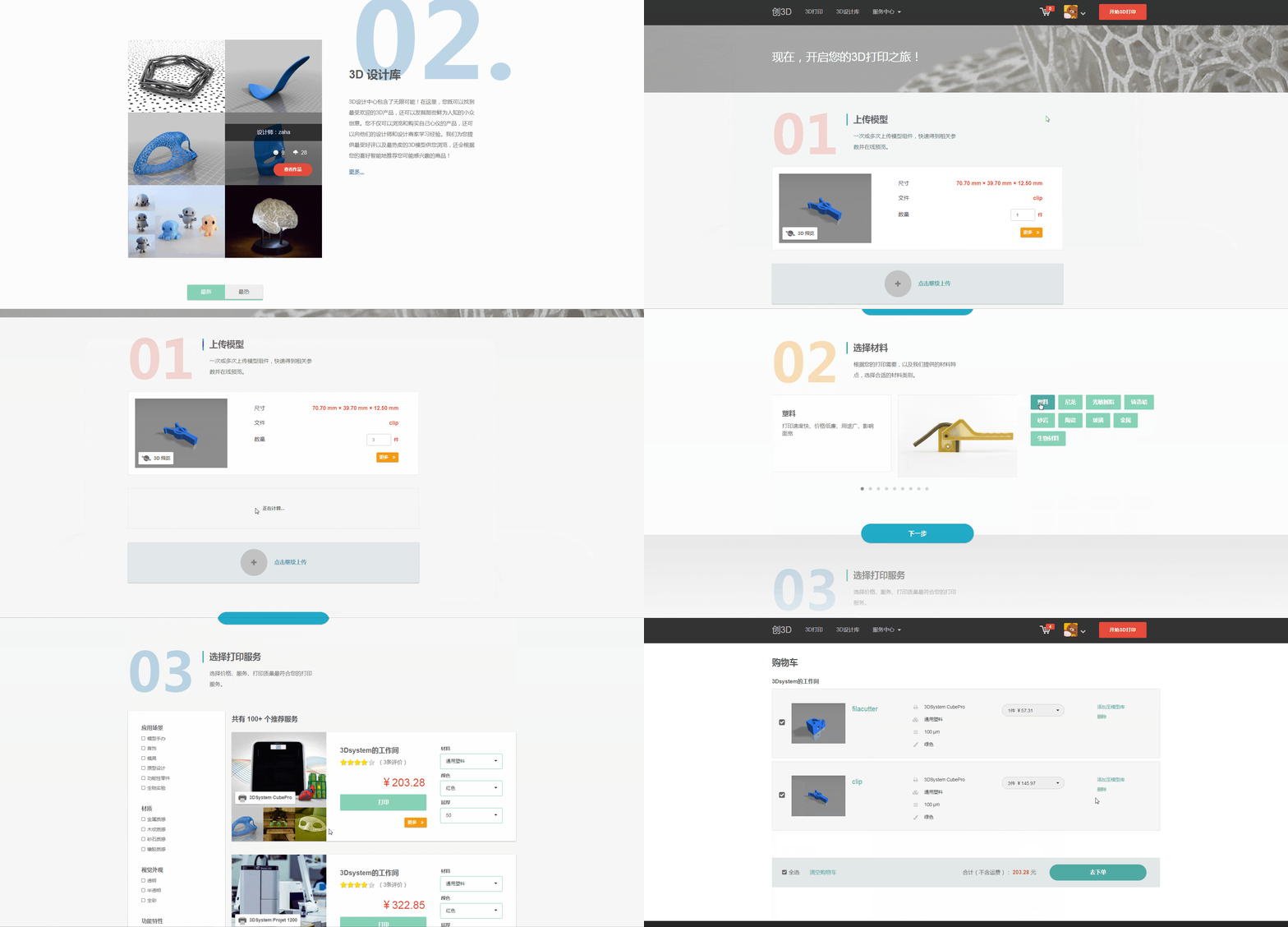
I started my exploration by scoping the user flow into three phases: upload my models, select a material category, and choose a 3D printing service. In this way, a complex and tedious process was decomposed into parts whose tasks were easier to understand and goals were clearer to achieve.

I then came up with a few design concepts while creating wireframes. Those concepts were:
- Create visually striking CTAs that compel users to click.
- Start from the task that is easiest and most requisite.
- Unlock the next phase until the current one is completed, bringing fewer choices to users.
- Prioritize imperative parameters, use straightforward copies and hide expert-level content.
- Integrate all three steps in one page for an unbreakable experience. This integrity keeps data consistent and interaction coherent.
The Highlight
Starting a 3D print is a focused job for users. Their primary goal is to find the most suitable printing service for their uploaded models. Due to 3D printing's nature, however, the task requires deep focus, manual input and selection, and back-and-forth decision-making.
My solution was utilizing SPA (Single Page Application), with which users could accomplish the task fluidly all in one page. Comparing to the multi-pages solution, I reduced the cognitive load that users took to make decisions as well as the drop-off rate caused by page-switching. During usability testing, I noticed better results in terms of effectiveness and efficiency.

The Result
After unifying back-end data, I finalized the flow as indicated below.


It creates a clear sense of assistance and reduces the unnecessity to a minimum so that all users can understand how things work without further explanation. Useful images and friendly language are added throughout. It also has animations and transitions, which adds a bit of fun. I am optimistic that users will get onboard and progress through all three phases with little friction, leading to successful customizations of their 3D prints.
DISCOVER USER PROFILES
The Problem
Tran3D, in essence, is a 3D printing community where users design, prototype, sell and purchase. However, different users have different roles—Designers productively transform their concepts into printable designs; manufacturers register 3D printers and promote their services; and like the rest of individuals, both can collect or purchase what they are interested in. So given a user,
- How can we distinguish his roles from others'?
- Which features should we support?
- How might we help showcase his characteristics and develop his own "brand"?
The Analysis
Upon browsing a user profile, one needs to identify that person's role and characteristics. According to this, I listed some keywords for ideation purpose.
- Architecture—Interpreting underlying data structure and class inheritance reduces the gap between design and development.
- Hierarchy—The item that first grabs the eye's attention is at the top of the hierarchy. Each item that draws attention next is subordinate to the one before it.
- Coloring—One of the easiest ways to distinguish objects is through colors.
- Personalization—Users get motivated if they are provided with more personalized choices.
The Exploration

After sketching out several candidates, I made the following design decisions.
1. Information Architecture
I separated users into three categories: common individuals, designers and manufacturers. All types shared the same template—Basic information was listed out; designs, collections, orders, followings and followers were organized into tabs. It is worth noting that designers were given an extra section to introduce their backgrounds, concepts and portfolios while manufacturers were given a shop page and a dashboard to manage printers, orders, etc.

2. Visual Hierarchy
I used Reversed-ソ Pattern—Our eye starts scanning from top left, then diagonally down, stopping at the bottom right. Within a short break, information on the top right might draw some attention. The diagonal line guides us to read the main content and the dot serves as a little weight for equilibrium.

3. Color Scheme
I chose the color palettes similar to flat UI. Complementary colors made personality stand out. Analogous colors kept our page clean and calm.

4. Personalization
Besides user settings, I highlighted 'Register', 'Create' and 'Follow' buttons and encouraged users to enrich their profiles. Also, behaviors such as creating and collecting would be included in followers' home feed, which kept the character active in his network.
The Highlight
I borrowed concepts from material design and flat design to set overall visual direction. Thinking about material design, it has three-dimensional qualities that are reflected in its use of surfaces, depth, and shadows. This concept is tightly relevant to 3D prints. A match between our visual system and the real world can strengthen the connection between our customers and products. It also aligns with our brand image: simple, rapid and technological.
The Result
Following images indicate a common user's profile, a designer's profile, a user's home and settings, respectively.


MANAGE SHOP SERVICES
The Problem
Tran3D schedules 3D printing services based on data and facts. It is important for manufacturers to provide authentic and detailed data. This is non-trivial work:
- Data encompasses various facets—It includes printers, materials, colors, layer thicknesses and more at lower granularity.
- Pricing strategies are extremely complex—They vary from case to case and are hard to get translated from mathematical models.
Therefore how might we help them upload data in an intuitive or instructive way and how might we organize their data for clarity purpose?
The Analysis
To get better insights, I interviewed 8 people who owned 3D printers. Based on their backgrounds and behaviors, I made three personas.
Manufacturer Persona
Frank
Frank, aged 32, is an assistant professor of material science at university. His lab owns 5 industrial 3D printers which could support more than 40 printable materials. Frank has rich knowledge about 3D printing and especially, he knows materials inside out. He is an expert in building mathematical models and experimenting new things.
Sarah
Sarah is an AM at Tiertime, a 3D print company in Beijing. She works for a team that is responsible for promoting their 3D printing services to all partners. Since she is not an expert, her job is to maintain or update data provided by her technical colleagues. In order to deal with different platforms from different partners, Sarah needs to quickly understand interfaces and exchanging information with the team.
David
David is a technology enthusiast and he is only 20. His father bought him a desktop-level 3D printer on his last birthday. He wants to make the full use of it. David knows how to use the printer but he has no idea about how to provide 3D print service—He can only create simple pricing strategies but he is not sure if they would work.
Their needs can be described as:
- Hierarchical—It is easier to navigate and understand the system by organizing content hierarchically.
- Standardized—Interactions are using the same paradigm so that users can understand.
- Complete—More complete data increases a manufacturer's credibility, therefore popularity.
- Intuitive—Uploading data is simple, not learned.
- Flexible—The system allows manufacturers to manipulate, whichever their backgrounds.
- Foreseeable—Any preview of the outcome would help manufacturers circumvent mistakes, lowering the possibility of failed strategies.
- Reversible—Data that is incorrect or outdated can be removed or modified.
The Exploration
During the ideation and prototyping phase, I mapped out solutions one by one:
1. Divide concepts into hierarchy.
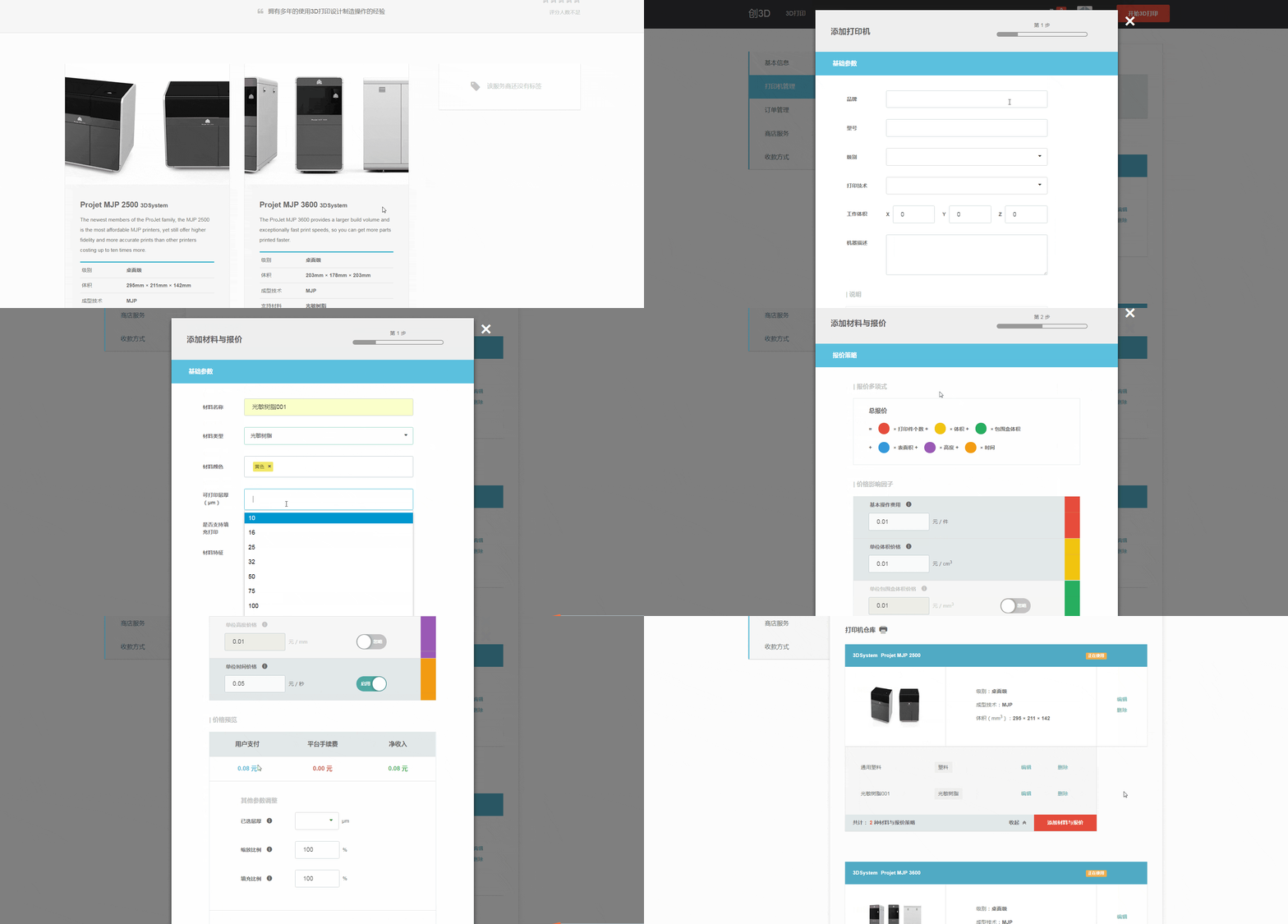
Manufacturers may lack the motivation to publish all service data in one single use. So I divided the process and organized them into levels. From the shop to specific objects like printer and material, a hierarchical design would very much facilitate user tasks.

2. Unify layouts and interactions.
I chose a component that had consistently shown up in Tran3D—the modal. This was because I did not want to overwhelm users with an unfamiliar UI. A modal also made them concentrate on what they were doing while kept the background as context. Within a modal, data uploading was split into steps and there was top navigation indicating the progress.
3. Include data that helps SEO and discoverability.
Titles, descriptions, tags, photos and categories are attributes for manufacturers to better describe their services. These can be descriptive and educational to someone outside of their niches. Completeness of data speaks aloud for services.
4. Utilize shapes and colors.
Making a pricing strategy is one of the most challenging tasks when manufacturers manage their services—Strategies in 3D print industry involve a variety of factors, not only the physical attributes but also laboring influences.
A common practice is using linear polynomial as the mathematical model which sums up a number of terms. The quantity of terms depends and each term is flexible due to possibly different interpolations.
During research, I realized that there was a huge gap between the system and its users, more specifically, the complexity that a pricing strategy could go and the capability for people to understand, digest and make adjustments for that.
Luckily, I found that building a one-to-one correspondence between a term and a colored shape was the most intuitive and efficient solution. It turned a complex math formula into objects that can be easily cognized and understood by human beings. Therefore, I illustrated this polynomial using simple shapes and colors:

5. Add flexibility to the system.
The module must be adaptive to users with different backgrounds. Consider a user with non-expert background, he might need notes for terminologies, tips for interactions and default values for complicated terms. On the contrary, an expert might need more specifications and details. And he wants to enable more terms in the polynomial to better control his pricing strategy.
6. Preview simulated results.
Manufacturers will get a live preview of what the price is after proposing a pricing strategy. The result is calculated by applying the pricing strategy to a test case we provide. It even gives instant feedback whenever the user makes any adjustment to the linear polynomial. This feature helps manufacturers find their suitable pricing strategies. It also makes them feel empowered so that they can trust our system.
7. Provide CRUD operations.
Service data like printers, materials, even pricing strategies are revisable if one makes any mistake.

The Highlight
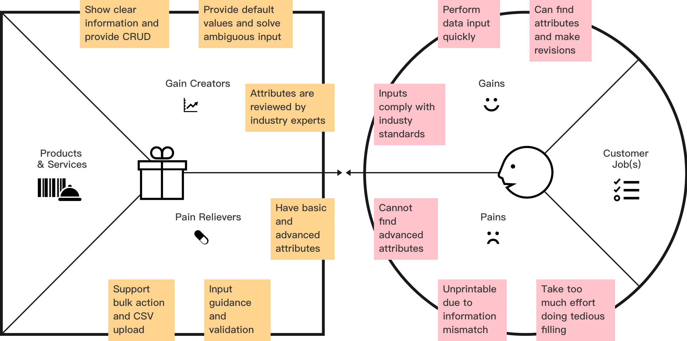
I want to highlight how I understood problems and developed insights from research using JTBD plus VPD framework. First, I identified three user types:
- Professionals—Like Frank, they understand 3D printing from theoretical and practical sides so they prefer a site that is professional. They would check attributes reactively due to availability changes.
- Proxies—Like Sarah, they are experienced in maintaining 3D printing data for companies and professionals. They need to perform frequent and intensive inputs to address business needs.
- Amateurs—Like David, they need more help to offer services because their knowledge about the industry is premature. They have few printers so that once setting up the shop, they barely change attributes afterward.
Through interviews, jobs and related outcomes (a.k.a. pains and gains) were extracted:
Jobs and Outcomes Analysis
User types
- Professionals
- Proxies
- Amateurs
Main job
- Set up Tran3D online shop
Related jobs
- Provide printers
- Provide materials that each printer supports
- Provide other attributes related to printers and materials
- Set up pricing strategy according to printer, material and other attributes
Pains
- Cannot find or adjust advanced attributes and lose trust
- Cannot understand and fill in some of the attributes especially advanced ones
- Receive orders that are unprintable due to information mismatch
- Take too much effort filling out forms
- Do not know how to set up the pricing strategy
- Do not know whether a pricing strategy would work
Gains
- Can trust platform because information to fill complies with industry conventions
- Can get all input done efficiently
- Can know if a pricing strategy is properly set up
- Can easily find attributes and make revisions
Given the knowledge, a mapping from pains to their relievers and gains to their creators was created. Below is an example for user type: proxies.

Some outcomes were common while some were specific. There were also conflicting needs of different types. For this reason, the solutions were flexible and compatible, treating all user types equally.
The Result
From the shop's main page to a modal that creates material and pricing strategies, I am satisfied that my design goals are accomplished across the site. The design is simple yet powerful, not only providing intuitive interfaces but also tailoring to different user needs. Meanwhile, a lot of UI elements are reused, contributing to the system consistency.


CONCLUSION AND REFLECTION
At the early stage of a startup company, I wanted to deliver a minimum viable product and provide a flexible structure that could scale naturally as the platform grows. Looking back, the project has included all the necessary functionalities and built upon a scalable framework. It has successfully leveraged the design language to promote a high-end technology, decoding the secret of 3D printing into a context that people can comprehend and make use of.
As a lead, the project also made me appreciate the importance of coordinating different perspectives and collaborating with different roles. It became one of the most precious experiences in my career.