Establishing a Business Tool Suite
In 2018, Booking.com, one of the largest travel e-commerce company unprecedentedly expanded its investment in China. For the sake of adapting to this unique and ever-evolving market, China team strategized rich marketing and operation plans, with their focus on customer acquisition and retention.
BIG PICTURE
Background
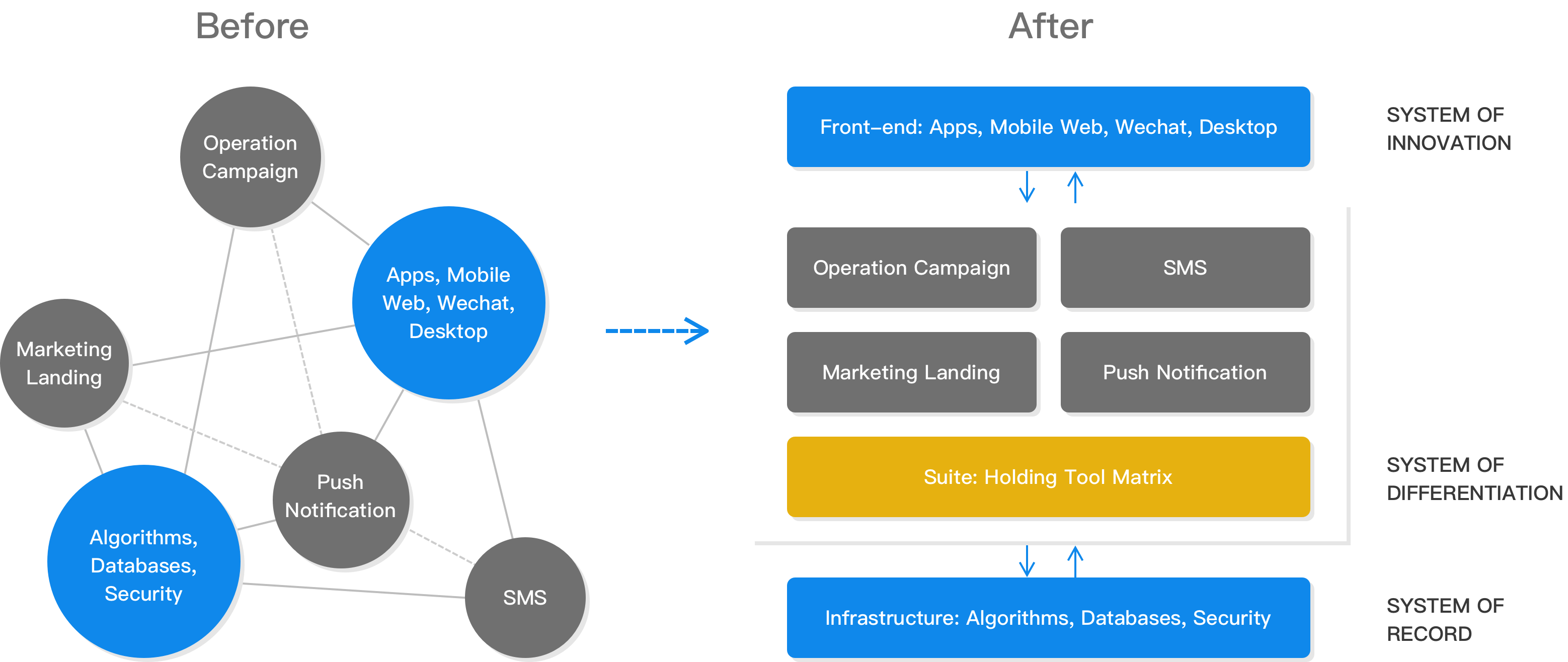
In the beginning, quick solutions including marketing landings, operation campaigns, SMS and push notifications were executed to address immediate business needs, aiming for more traffic as well as more engagement.
General Problems
After piloting a few marketing and operation programs, results were less than satisfactory. Three critical issues were identified on the product and design side.
- No infrastructure—there were neither standardized workflow nor tools to enable it; few services, features or design elements were reusable.
- Extremely low productivity—technical dependencies were complicated, communication cost high, and human resources lacked.
- Misalignment between products and business operations in terms of design direction—few designers were involved, and those early programs did not carry the same personality as our apps and sites.
High-level Solution—a Business Tool Suite
As the only product designer on the team, I suggested we build a platform incorporating a matrix of tools, with each of them catering to one major need from the business.
Similar to the system of differentiation defined in Gartner's pace-layered application strategy, this tool suite, on the one hand, communicates with core algorithms and databases, on the other hand, provides APIs so that it is adaptive and agile enough to support various service calls and frequent front-end changes.

Objectives of the tool suite were:
- Facilitate an effective and sustainable workflow across teams; provide reusable services, features or design elements
- Decouple dependencies, reduce communication cost and free up human resources
- Set up design direction and generate pattern library to align business with products
I will choose one representative tool that best showcases what the problems were and how we solved them.
CMS FOR CAMPAIGN PAGE
Problem
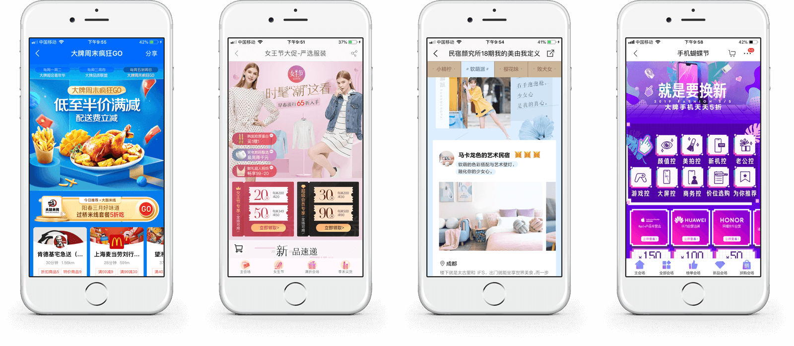
Campaign pages are extremely common in Chinese e-commerce platforms. One of their distinguishing characteristics is that they are content-focused. Content, though taking various forms, is usually created, grouped and organized based on business impact or customer interest. Examples are listed.

By working closely with the operation team, we understood our internal needs were:
- Can rapidly create, group and organize unique content for each campaign
- Can flexibly change and deploy content
- Can follow guidelines to ensure design quality
On the other hand, our customer needs were:
- Can browse and navigate through content easily
- Can understand the theme that content reflects
- Can build up interest by viewing properties, incentives or travel-related articles
Thus, our goals were inferred—first, to achieve self-service campaign creation, implementation, and modification; second, to strike a balance between weight, quality, and entropy of content such that customers understood and became interested.
This yields a Content Management System.
1. Structure and Hierarchy
The first step I took was understanding the structure and hierarchy of content. I wanted to identify and extract patterns that can be generalized into tools and processes.
Since we mainly listed featured properties, incentives, or articles, I categorized all campaigns into two: commodity-focused and inspiration-focused. The former exploits business opportunities, incentivizing customers to book immediately while the latter offers an inspirational context to trigger customer interest before any travel plan.
I created mind mappings of the two—different page elements were generalized and extracted. Each of them fell into a specific hierarchy, whether it was a template, a pattern, a component, or an atom.


This approach, in a very logical way, showed elements and their associations. Besides, I saw strong correlations between the results and the information architecture of CMS.
Note that I left items that were optional or foreseeable as placeholders, making the system robust and scalable in the long run.
2. Content Generation Flow
The process of forming a content structure was essentially an inverse of how I decomposed it. The concept is similar to Atomic Design in which everything begins with the smallest element of the interface: the atom, then forms molecule, organism, template and eventually the page.

This process brought insights to the workflow that our operation team would follow to generate content: 1. create a blank page, 2. choose a template, 3. create modular sections, 4. add components, and 5. populate data, copy and visual elements.
3. Design Values and Guidelines
Although campaign content is highly diversified and flexible, it should not drift too much away from the personality that our products have already had. In this case, we wanted to set up a design guideline that generated content can automatically follow.
Extensive research was conducted to figure out opportunities that lay within brand identity, products, and customer expectations.
Highlighted Research Questions
What is the main message our brand tries to deliver?
Our brand encourages everyone to travel boldly using the reliable services we provide.
What is the mental model in which our loyal customers think of us?
In the focus group, we found out 1) pros: Booking.com had various properties, trusted reviews and easy booking process 2) cons: there were few incentives and little inspiration they could get.
What are the design values we need to keep anyway?
We design for people. Our job is to make it as simple and effective as possible for everyone involved to succeed when they interact with our service.
What are the aspects that a campaign page can differ from the products?
We want to get our customers attracted and inspired. We want to introduce an interesting and enjoyable atmosphere.
By envisioning the campaign page and comparing it to our general product, we discovered generality in terms of clarity and effectiveness, yet peculiarity in terms of intriguing and delightful experience. Therefore we decided to set clarity and interestingness as our design values.
The next step was to translate the values into something tangible. Here, I want to highlight three foundations that push them forward. They are rounded shapes, white space, and subtle gradients.

For example, I followed these basics when exploring variants of property cards.

It was important that the guideline not be simply comprised of UI elements, but also more molecular pieces that need to be used across the experiences in campaigns. Thus, I transformed similar variants into generic components. I also dissected the generic component and rethought about its variations by adding or removing an atom in it.

In this way, we gradually established and enriched the design pattern library.
Mock-ups
For the content management system itself, we use Ant Design as its nature and determinacy help our internal users finish their jobs effectively and efficiently.
Our internal users would first initiate a new campaign and select a template for it by choosing commodity-focused or inspiration-focused.


The tool then led them to set up the new page properly including basics, sections, and navigations.


Section modules, in particular, were categorized according to previous mind mappings. To name a few, we have coupons, destinations, co-brandings, and properties as the module types.

After creating a new section module, our internal users populate specified components inside. For example, they could add various properties to a module and decide how to group and prioritize them within it. More importantly, they could select one of the layout options that are compliant with our design values.
Therefore, even though it is quite flexible to generate the content, our design guideline helps us ensure clarity and consistency.


We saw significant performance improvement after we launched this tool. In respect of productivity, we saved 3-days working time per person on each campaign and were able to run operation campaigns on a weekly basis. In respect of quality, the number of hits on properties achieved 30% to 34% year-over-year uplift.
RESULTS
Finally, here are some operation campaign pages that went live thanks to the team effort.

Other affiliated tools that facilitated sourcing and publishing for operation campaigns were also built. By integrating tools for marketing landings, coupon issuing, SMS and push notifications, we were able to establish a tool suite that drove fast business growth.